case studies Case study
Streamlining User Experience for money254.co.ke
Introduction
This case study outlines the recent redesign of the money254.co.ke landing page and search experience. The goal was to enhance usability, reduce friction, and align the platform with modern design principles while maintaining its core functionality.
Key Objectives
- Simplify the user journey to reduce the steps needed for results.
- Modernize the interface to improve engagement and satisfaction.
- Implement dynamic interactions to minimize page reloads.
Previous Experience: Opportunities for Optimization
The original design effectively provided users with financial product comparisons but presented opportunities to streamline the journey. Users previously navigated up to 5-page loads to reach results, introducing friction and delaying decision-making. The layout prioritized comprehensive information but could benefit from a more guided, intuitive flow.
Redesign Highlights
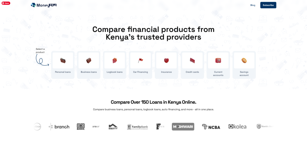
Include the searches and results on one page.
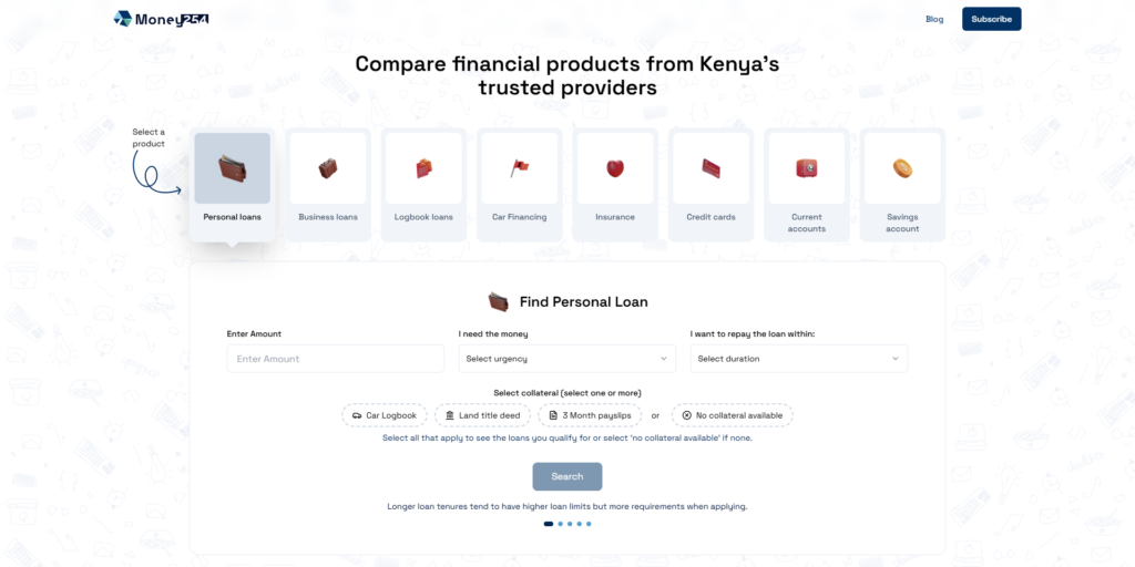
When a user clicks a product, all search requirements are displayed instantly, avoiding page steps. A user fill everything in one place and clicks search.
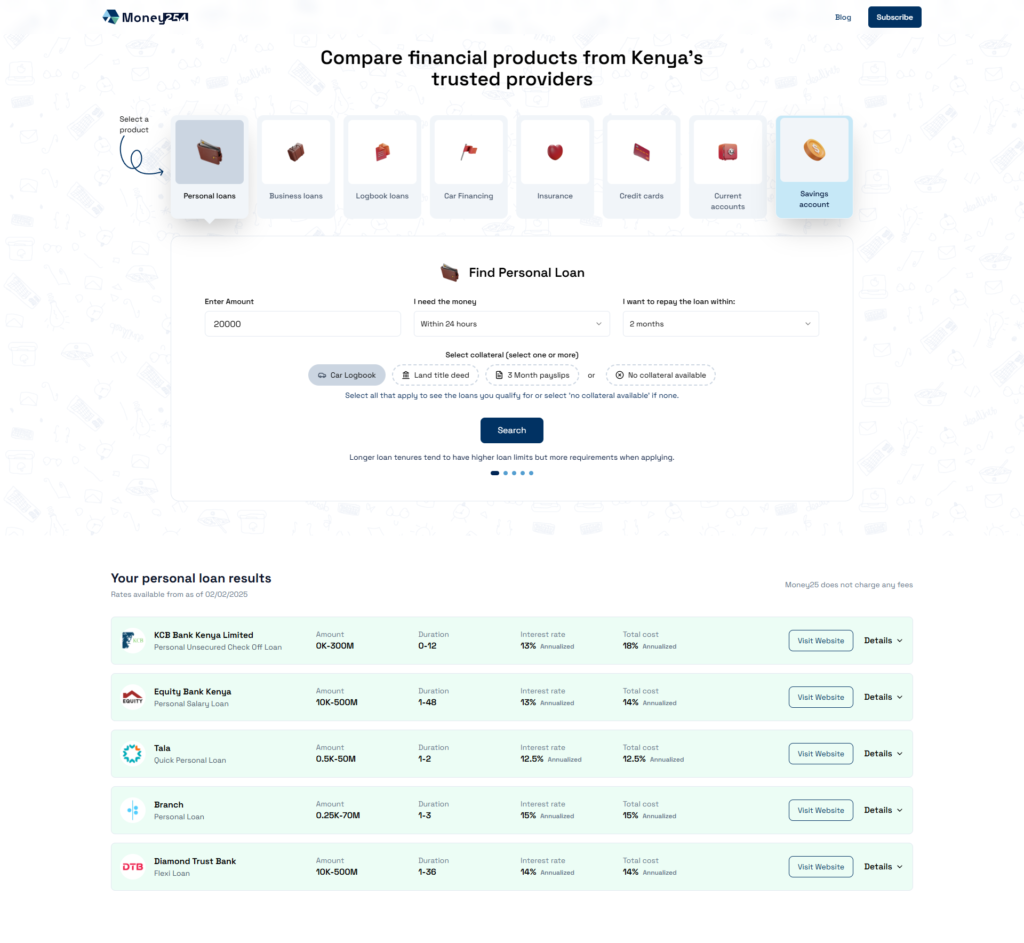
When the search is completed in the background, the results are again displayed on the same page.
- Single-Page Efficiency
- Implemented React to handle search and filtering dynamically, reducing the process to 1 initial page load.
- Users now interact seamlessly with search modules and results without interruptions, accelerating their path to conversion.
- Simplified Search Flow
- State 1 (Page Load): A clean, focused layout directs users to core actions (e.g., search, product categories).
- State 2 (Search Module): A centralized, intuitive search interface opens dynamically, reducing visual clutter.
- State 3 (Results): Instant, inline results display with filtering options, eliminating unnecessary navigation.
- Modern Brand Alignment
- Introduced a refreshed logo and visual identity to reflect innovation and trust.
- Consistent typography, spacing, and color schemes enhance professionalism and readability.
Results & Benefits
- Dynamic, Single-Page Loan Comparison
- Users can now enter loan details, filter options, and receive results—all without leaving the page.
- The redesign minimizes the number of page loads from up to five in the previous version to just one, significantly improving efficiency.
- Interactive Search Module
- Instead of navigating through different sections, users now have a dynamic search module on the homepage.
- The module allows for quick input of loan criteria, providing a more intuitive and engaging experience.
- Instant Loan Results Display
- Users reach results in 80% fewer steps (from 5 page loads to 1), reducing decision fatigue.
- This improves decision-making and helps users find the right financial product faster.
- Enhanced UX with React Implementation
- We introduced a highly responsive UI by leveraging React, ensuring a smoother and faster interaction than traditional page reloads.
- The transition between selecting a product, searching, and viewing results feels natural and frictionless.
Stakeholder Impact
- User Satisfaction: A streamlined experience fosters trust and loyalty, encouraging repeat visits.
- Operational Efficiency: Reduced server load and faster interactions lower long-term maintenance costs.
- Brand Perception: The modernized design positions money254.co.ke as a forward-thinking leader in financial comparison.
Conclusion
This redesign prioritizes user-centricity and technical innovation, aligning money254.co.ke’s platform with best practices in UX and modern web development. By minimizing friction and emphasizing clarity, the updates empower users to make informed financial decisions effortlessly—a win for both customers and the business.