Designing a poster based on the client brief which was based on two poster designs. One poster would be the art direction while the other would be the color inspiration.
Step one
This being the art direction…
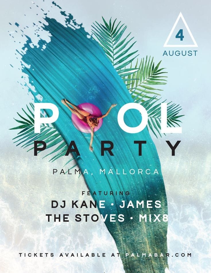
the first step was to break down the design elements that made the client to like this design.
- there’s a paint brush swoosh that masks the ocean water below.
- The theme has a cool and relaxed color scheme.
- There’s a highlight color (pink) that stands out and brings attention to the word pool.
- The use of sans typefaces.
- The addition of leaves add to the natural look and feel.
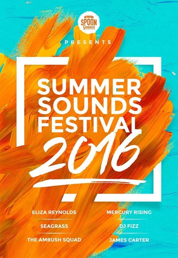
Step 2: Poster inspiration 2
The inspiration from the poster above was more structural considering the client wanted the color scheme from poster number 2. Spefcifically the oranges.
Designing
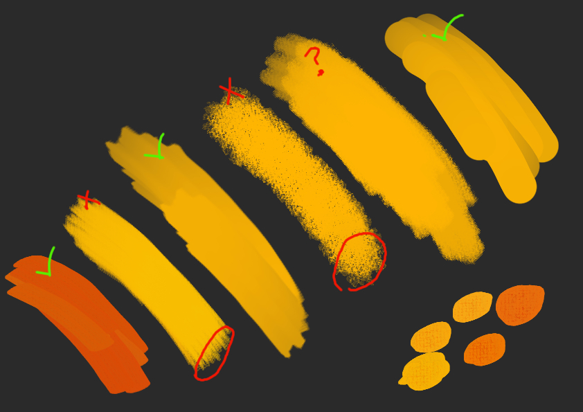
The paintbrush swoosh
The first thing was to create a swoosh, it did not have to be the exact same brush, but it should have a 3D effect with the textures. I tried a couple of brush strokes to see which one fits well with the overall aesthetics for Dear bride. The idea of the paint swoosh is to use it as a mask, it should not be a distraction so any brush that had a texture on the edges will be removed for now. Things could change.
We shall come back to this later
The brush shape
Instead of manually painting the swoosh, I got brush masks online to act as a guide.